Author: cheqdin
Published Date: October 22, 2018
So, you’re all set to start a new day nursery. Now, how do you go about arranging the nursery space, weaving in functionality, aesthetics and efficiency while avoiding some of the common mistakes nursery owners make when organising the activity areas?
A well-organised nursery space is one that offers children a balance of structure, safety, freedom and the resources to smoothly explore boundaries and build their independence – without a helicoptering adult continually intervening with sharp directives.
Though factors such as the business owner's educational philosophy, personal taste, budget and government regulations will undoubtedly influence the end design of the nursery space, the basic layout should remain more or less the same for most settings, with each nursery room divided into activity spaces appropriate for the developmental stages of each age groups.
A cosy well-lit story corner with a collection of books and comfortable cushions, a role-play area with props to unleash their imagination, a messy play area near the sink that can double up as a mealtime area, a quiet space to sleep or wind down - and the list can go on and vary slightly depending on the age groups.
There are numerous resources online for the layout of nursery spaces. But, in this article, we'll focus our attention on the key points to avoid when arranging these activity spaces.
1. Overlooking the legal stipulations for minimum space requirement
Balancing functionality with aesthetics - and within the confines of space constraints - can be a tricky act. But a point that shouldn't be overlooked in the process is - the legal regulations in your area for the minimum space that should be allocated for each child registered at your setting. In England, the EYFS has laid out the minimum indoor floor space requirement for nursery settings as follows:
• Children under two years: 3.5 sq.m per child
• Two-year-olds: 2.5 sq.m per child
• Children aged three to five years: 2.3 sq.m per child
For example, if you plan to enrol ten children in the under-twos room, you would require a minimum space of 35 sq.m for use by the children in the room (the net area used by children), excluding storage and other common areas. You can do the calculations yourself or even print out the downloadable sheets from Flick to work out the minimum space requirement for your nursery setting.
2. Leaving dead spaces in the centre of the room
Leaving large open spaces or long corridors in the centre of the room is a big no. The reason? Open spaces without a clear boundary is a great encouragement for the energy bundles to run around in overexcited play, triggering unruly behaviour.
Using physical dividers likes shelves or storage units or even visual dividers like rugs can help to demarcate them as designated activity areas, bring about structure, regulate disruptive behaviour and allow the children to train and retain their focus on meaningful activities.
3. Arranging activity spaces without considering the flow of traffic
Having a little army of toddlers who are headed to the toilet, march through another group's newly built model farm can be like stirring the hornet's nest. Routing the traffic flow smoothly around the activity areas right at the planning phase can help prevent a lot of tears and tantrums and allows easier supervision for staff members.
A good idea would be to sketch the layout of the activity centres after considering the traffic routes to the doors, sink and toilets, ensuring through traffic does not interrupt any play in progress.
4. Creating an over-stimulating environment
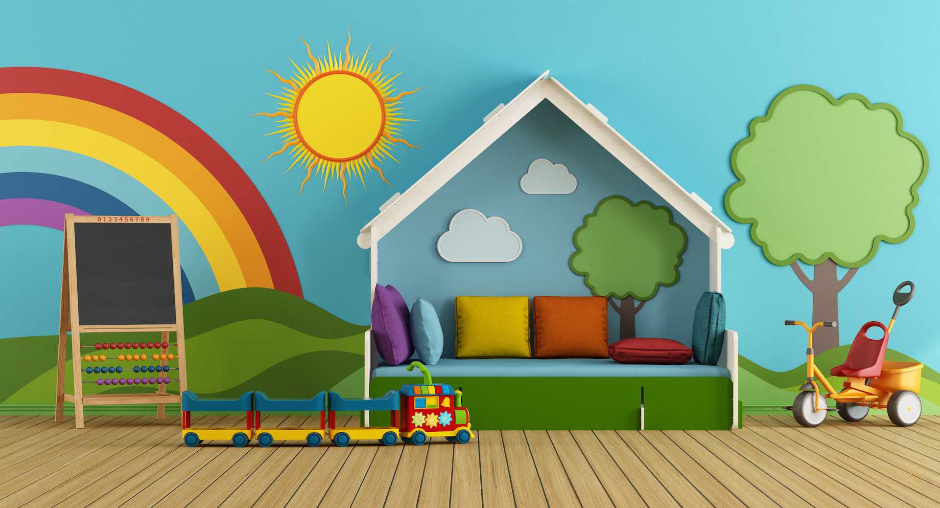
As much as the nursery environment should kindle curiosity and imagination, it is essential to exercise moderation when it comes to choosing the décor and colour scheme. As opposed to the common belief that children should be surrounded by bright colours, contemporary researches on learning spaces suggest a bold palette and an overly bright environment can make it difficult for children to relax and concentrate on an activity.
Warm, neutral, earthy tones with splashes of colour can lend a sense of warmth and tranquillity without creating a visual pandemonium. Cheerful rugs or wall hangings, children's artwork (again displayed in moderation) and tasteful wall decals can add excitement to a neutral décor without being overwhelming.
5. Too many activities, too many toys!
Now there is indeed something as too much of a good thing! No matter how exciting they may be, a profusion of toys and activity centres can end up creating a cluttered, overstimulating environment. Less is more when it comes to taming the fleeting attention span of the little explorers. A structured arrangement of a few good toys gives them a clearer idea of where to find and return them and help to provide them with a sense of control, minimise distraction and bring about peace and order to their little child-centred world.
Now that you have learnt about the minimum space requirements for a day nursery and how to effectively organise your nursery space, have you considered the next important step of organising your nursery management? Cheqdin's easy-to-use Nursery Management Software & Daycare app allows you to manage the children's daily registers and booking information, share daily diaries, photos and videos and more. Interested in trying out all of our exciting features?


